


Posted by Jake on Saturday, February 15, 2014 with No comments | Labels: Article, Bonus, executive, Graphs, pay, taxation
 [UPDATED JAN 2017: No change! High Pay Centre stats show those bosses are still obscenely overpaid. READ ON...]
According to the High Pay Centre, by lunchtime on the third working day of the year the average FTSE100 company director had earned as much as the average Briton will in the whole of 2014. At this rate of pay, the average FTSE100 boss earns in a year what an average Briton earns in a lifetime. Is s/he worth it?
Apologists for excessive pay assert that pay is set by the market, and that high pay rewards high performance. Is that true? Or is it actually a case of executives capturing the company revenue stream and diverting it into their pockets?
A report titled "An Analysis of FTSE 100 Company Director Pay" by Verum Financial Research provides evidence contradicting the 'pay for performance' assertion. The report looks at the statistical correlation between pay and a series of executive performance measures. It finds that there is a moderate correlation between pay and two of the more manipulable (i.e. dodgy) measures: Profit After Tax and Return On Equity. The report finds that correlation with three more meaningful measures are actually negative (i.e. the worse your performance the more you get paid): Cash Return On Invested Capital (CROIC); Operating Cashflow; Cash As A Percentage Of Profit.

Examples of why 'Profit After Tax' and 'Return On Equity' are dodgy measures of performance:
a) Profit After Tax: there is a moderate positive correlation of 0.6. The more Profit After Tax, the more the executive pay. Which perhaps explains why big companies try so hard to dodge tax. The less tax you pay, the more 'profit after tax' is left.
b) Return On Equity: there is a moderate positive correlation of 0.57. One way of boosting Return On Equity is to borrow vast amounts of money (just as the banks did, leading to the banking collapse). To understand this, think of two hamburger stalls:
- John has £1,000 of equity. He buys £1,000 burgers wholesale for £1 each, and sells them for £1.50 each, making a return of £500. His return on equity is £500/£1,000 = 50%.
- Den also has £1,000 of equity. He borrows £9,000 and buys £10,000 of burgers wholesale for £1 each. He sells them for £1.50 each, making a return of £5,000. His return on equity is £5,000/£1,000 = 500%.
 |
| Graph illustrates an example 0.6 correlation |
The least correlated metrics tend
to be those that focus on cash and cash returns including cash return on invested
capital (CROIC), cash flow from operations, and cash as a percentage of profit.
Cash return-based metrics are particularly important to investors as cash flow
figures are less easily influenced by creative accounting techniques.
The measures referred to by Verum as being particularly important to investors are:
a) Cash Return on Invested Capital: correlation of -0.1
b) Operating Cashflow: correlation of -0.25
c) Cash as % of Profit: correlation of -0.35
As the graph illustrates, it is well worth a FTSE100 director allowing these measures to slip. Not because he doesn't care about them, but because they don't take care of him.
 |
| Graph illustrates an example -0.2 correlation |
Any decent statistician will tell you that correllation doesn't prove causality (just because two things happen doesn't prove one caused the other). In FTSE100 boardrooms the causality is all about the cash.
What the evidence of the correlation does show is high pay is not reserved for high performance.
What the evidence of the correlation does show is high pay is not reserved for high performance.

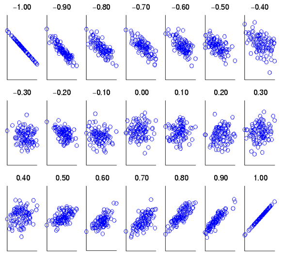
A QUICK LESSON ON CORRELATION FOR THE STATISTICALLY CHALLENGED:
The "correlation" measures how closely the "pay for performance" assertion is followed. If the rule is followed perfectly (i.e. the better your performance the higher your pay) the correlation is 1.00.
 If the opposite of the rule is perfectly followed (i.e. the worse your performance the higher your pay) then the correlation is -1.00.
 If pay has no relationship at all to performance than the correlation is 0.00. In this way correlations range between +1.00 and -1.00 depending on how the rule is followed or ignored.
 According to the British Medical Journal, correlations, positive or negative, may be considered thus:
We have illustrated the correlations using graphs snagged from a student message board discussing correlation that we randomly came across when looking for graphs illustrating correlations. The graph appears around the internet, so we aren't sure who to credit. The full set of graphs is given below:
The "correlation" measures how closely the "pay for performance" assertion is followed. If the rule is followed perfectly (i.e. the better your performance the higher your pay) the correlation is 1.00.
- 0-0.19 is regarded as very weak,
- 0.2-0.39 as weak,
- 0.40-0.59 as moderate,
- 0.6-0.79 as strong
- 0.8-1 as very strong correlation
We have illustrated the correlations using graphs snagged from a student message board discussing correlation that we randomly came across when looking for graphs illustrating correlations. The graph appears around the internet, so we aren't sure who to credit. The full set of graphs is given below:


0 comments:
Post a Comment
Note: only a member of this blog may post a comment.